Android Nomad #54 - Creating a Scalable Design System with Jetpack Compose

Creating a consistent and scalable design system is a cornerstone of modern app development, and Jetpack Compose offers a powerful toolkit to make this process seamless. This blog will guide you through the essentials of building a robust design system with Compose, covering key concepts, practical steps, and the benefits it brings.
Design System
A design system ensures a cohesive and recognizable user experience by maintaining consistency across all aspects of a product’s design. It serves as the foundation for streamlined collaboration between designers and developers, reducing design debt and enhancing scalability.
A comprehensive design system includes:
- Component Library: Reusable UI components.
- Branding: Colors, typography, iconography, and shapes.
- Design Principles: Visual and functional aspects of the product.
- Content Guidelines: Standardized assets and messaging principles.
- Accessibility Guidelines: Inclusive design considerations.
By combining these elements, you can streamline the development process, reduce design debt, and enhance collaboration between designers and developers.
1. Building a Material Color Scheme with Tokens
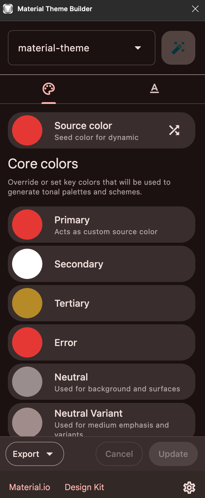
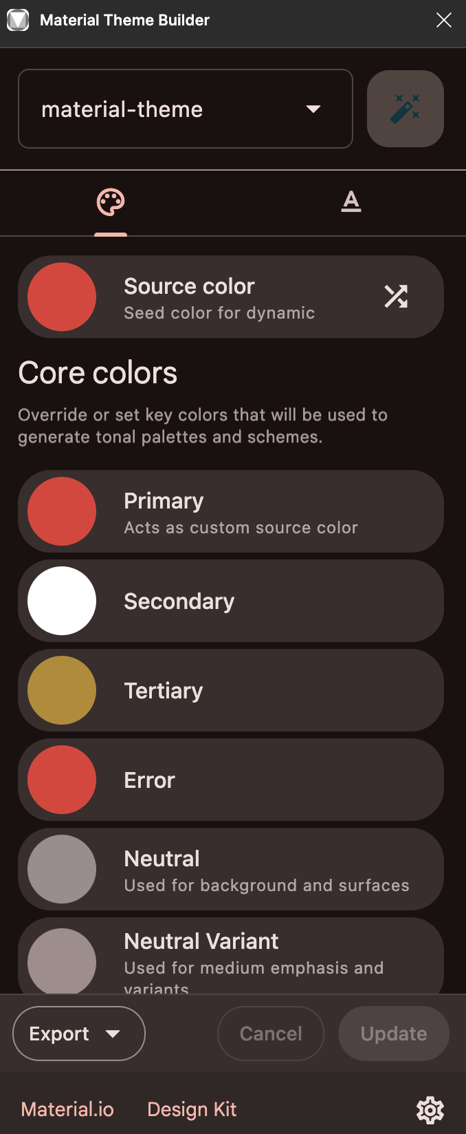
One of the first steps in creating a design system is defining a color scheme. Using the Material Theme Builder Figma plugin simplifies this process:

Generate Colors: Quickly create a cohesive color scheme with a few clicks.
You can literally generate the color scheme with few clicks. This plugin lets you export this color as literal theme files which can be dropped into your project.
The tokens are built-in and they are already setup for you.

Export Theme Files: Export the generated colors as theme files, including:
ui/theme/Color.kt: Contains all colors used by your theme and assigns them to roles.ui/theme/Theme.kt: Includes code to instantiate an app theme.ui/theme/Type.kt: Contains all typeface definitions.
How to Integrate:
- Unzip the exported files and copy them to
/app/src/main/java/<your_package>/. - Update the package name from
com.example.ui.themeto your app’s package name.
By starting with these files, you’ll have a strong foundation for maintaining color and type consistency.
2. Modularize
Modularization is optional but beneficial for multi-module apps. It allows better separation of concerns and easier maintenance.
Steps to Modularize:
- Create a new module for your design system.
- Drop the theme files into the appropriate package.
- Enable Compose features in the module by updating the
build.gradlefile.
3. CompositionLocalProvider
By default, the theme defined in the project or the plugin may have this structure.
@Composable
fun AppTheme(
    darkTheme: Boolean = isSystemInDarkTheme(),
    // Dynamic color is available on Android 12+
    dynamicColor: Boolean = true,
    content: @Composable() () -> Unit
) {
  val colorScheme = when {
      dynamicColor && Build.VERSION.SDK_INT >= Build.VERSION_CODES.S -> {
          val context = LocalContext.current
          if (darkTheme) dynamicDarkColorScheme(context) else dynamicLightColorScheme(context)
      }

      darkTheme -> darkScheme
      else -> lightScheme
  }
  val view = LocalView.current
  if (!view.isInEditMode) {
    SideEffect {
      val window = (view.context as Activity).window
      window.statusBarColor = colorScheme.primary.toArgb()
      WindowCompat.getInsetsController(window, view).isAppearanceLightStatusBars = darkTheme
    }
  }

  MaterialTheme(
    colorScheme = colorScheme,
    typography = AppTypography,
    content = content
  )
}
We may want to tweak this and place this under CompositionLocalProvider for passing data down through the Composition implicitly.
@Composable
fun DesignSystemTheme(
    typography: DesignSystemTypography = DesignSystemTheme.typography,
    dimensions: DesignSystemDimension = DesignSystemTheme.dimensions,
    elevation: DesignSystemElevation = DesignSystemTheme.elevation,
    radius: DesignSystemRadius = DesignSystemTheme.radius,
    icons: DesignSystemIcon = DesignSystemTheme.icons,
    darkTheme: Boolean = isSystemInDarkTheme(),
    dynamicColor: Boolean = true,
    content: @Composable () -> Unit
) {
    val colorScheme = when {
        dynamicColor && Build.VERSION.SDK_INT >= Build.VERSION_CODES.S -> {
            val context = LocalContext.current
            if (darkTheme) dynamicDarkColorScheme(context) else dynamicLightColorScheme(context)
        }

        darkTheme -> darkScheme
        else -> lightScheme
    }
    val view = LocalView.current
    if (!view.isInEditMode) {
        SideEffect {
            val window = (view.context as Activity).window
            window.statusBarColor = colorScheme.primary.toArgb()
            WindowCompat.getInsetsController(window, view).isAppearanceLightStatusBars = darkTheme
        }
    }

    CompositionLocalProvider(
        LocalColors provides colorScheme,
        LocalDimensions provides dimensions,
        LocalTypography provides typography,
        LocalElevation provides elevation,
        LocalIcon provides icons,
        LocalRadius provides radius,
        LocalIndication provides rememberRipple(),
    ) {
        content()
    }
}
This approach ensures that the theme dynamically adjusts, and changes propagate from the parent node to its children.
4. Reusable Component
Reusable components are the building blocks of a design system. Examples include:
- State Indicators: Represent loading, error, or unknown states.
- Image Views: Standardized image handling.
- Text Fields: Consistent styling for user input.
- Media Elements: Components for videos and interactive content.
Accessibility Considerations:
- Ensure proper roles and semantic definitions.
- Use alt-text for media components.
- Support live regions for dynamic updates.
By focusing on these aspects, your components will be robust and accessible.
You can refer to the following posts to learn more about accessibility


5. Testing Your Design System
Compose makes testing easier with tools like Compose Preview and the Compose screenshot tool.
Testing Scenarios:
- Light/Dark themes.
- Different devices and screen sizes.
- Multilingual support.
- Varying font sizes and animations.
Use these tools to visualize and validate components under diverse conditions, ensuring a polished user experience.
You can learn more about testing strategies from the developers of this tool here.
Benefits of a Design System
- Consistency: Uniform design across the app.
- Scalability: Easily extendable for new features.
- Reusability: Shared components reduce redundancy.
- Testability: Easier debugging and validation.
- Accessibility: Inclusive design as a priority.
Conclusion
Jetpack Compose, combined with Material3 guidelines, empowers developers to build design systems that are consistent, scalable, and visually appealing. By following the steps outlined here, you can create a robust foundation for your app while streamlining collaboration and enhancing user experience. Happy coding!

